
Histogram from the Image on Google Earth Engine (GEE) with python API
 with python API")
Let’s dive in with the basic concept first. I would like to go with an introduction and use case.
Introduction:
When presenting and summarizing discrete or continuous data, histogram is the chart you are looking for. By displaying the amount of data points that fall inside a given range of values (referred to as "bins or interval" or "buckets"), it essentially provides a visual interpretation of numerical data. It resembles a horizontal bar graph. A histogram, in contrast to a vertical bar graph, does not display any gaps between the bars.
Components of a Histogram:
-
The title: The title describes the information included in the histogram.
-
X-axis: The intervals on the X-axis display the range of values that the measurements fall within.
-
Y-axis: The Y-axis displays the frequency with which the values appeared inside the ranges defined by the X-axis.
-
The bars: The width of the bar displays the interval that is covered, while the height of the bar displays the frequency with which the values occurred inside the interval. The width of each bar should be the same for a histogram with equal bins.
Distributions of a Histogram:
- A normal distribution
- A bimodal distribution
- A right-skewed distribution
- A left-skewed distribution
Image Histogram:
Image histograms visually summarize the distribution of a continuous numeric variable by measuring the frequency at which certain values appear in the image. The x-axis in the image histogram is a number line that displays the range of image pixel values that has been split into number ranges, or bins. A bar is drawn for each bin, and the width of the bar represents the density number range of the bin; the height of the bar represents the number of pixels that fall into that range. Understanding the distribution of your data is an important step in the data exploration process. (ArcGIS Pro)
Image Histogram on Google Earth Engine (GEE):
The official documentation for creating histogram chart can be found here. But this can be only used on the code editor but not on the python API. For Python api, I am going to use reducer function: ee.Reducer.histogram. It will create a reducer that will compute a histogram of the inputs (shapefile as area of interest).
Now, I will move onto the implementation part.
-
Import the modules required for plotting chart
# import libraries import seaborn as sns import matplotlib.pyplot as plt import pandas as pd -
Import google earth engine (gee) api and initialize the athentication
import ee ee.Initialize() - Import image and feature of your requirement
In my case I have taken Landsat 5 year composite for image and Nepal's Bagmati zone as feature. Make sure you have single feature in the feature collection.# Load input imagery: Landsat 5-year composit image = ee.Image('LANDSAT/LE7_TOA_5YEAR/2008_2012') admin2 = ee.FeatureCollection("FAO/GAUL_SIMPLIFIED_500m/2015/level2"); region = admin2.filter(ee.Filter.eq('ADM2_NAME', 'Bagmati')) - Apply the Histogram reducer on the geometry we have taken
Be sure you adjust other parameters like scale as per your image instant and necessity.# Reduce the region. The region parameter is the Feature geometry. histogramDictionary = image.reduceRegion(**{ 'reducer': ee.Reducer.histogram(30), 'geometry': region.geometry(), 'scale': 30, 'maxPixels': 1e19 }) # The result is a Dictionary. Print it. # print(histogramDictionary.getInfo()) - Convert the gee dictionary object to client side python dictionary
histogram = histogramDictionary.getInfo() - Extract the Band information
You can take the band information as per your need. Please modify the list for band as per your need.bands = list(histogram.keys()) bands - Plot the histogram plot for each bands
for bnd in bands:
    # plot a bar chart

    y=histogram[bnd]['histogram']
    x=[]
    for i in range(len(y)):
        x.append(histogram[bnd]['bucketMin']+i*histogram[bnd]['bucketWidth'])
    data = pd.DataFrame({'x':x,
                             'y':y})

    # Draw Plot
    fig, ax = plt.subplots(figsize=(30, 7), dpi=80)

    sns.barplot(
        data= data,
        x= 'x',
        y= 'y',
        ax=ax
    )
    # For every axis, set the x and y major locator
    ax.xaxis.set_major_locator(plt.MaxNLocator(10))


    # Adjust width gap to zero
    for patch in ax.patches:
        current_height = patch.get_width()
        patch.set_width(1)
        patch.set_y(patch.get_y() + current_height - 1)

    # figure label and title
    plt.title('Histogram for Band: {}'.format(bnd), fontsize=18)
    plt.ylabel('Frequency (in power 10)', fontsize=18)
    plt.xlabel('Pixel value (interval-bucket width {})'.format(histogram[bnd]['bucketWidth']), fontsize=16)
    # save the fihure as JPG file
    fig.savefig('figure/fig-{}.jpg'.format(bnd))
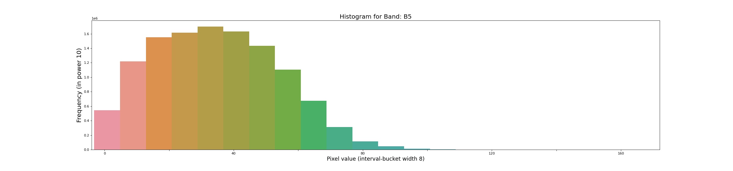
Here is the some output of the histogram of bands of image. Please visit the github site for all outputs.
Histogram for Bands: B1
 Histogram for Bands: B5
Source code: github_link
Please let us know your thoughts on this with following comment section we will definetly reach out to you on your query and feedback.
0 Comments